Reporting to the Senior UX Manager, I worked remotely for Quest Software as a Senior UX Designer with design peers, product owners, project managers and engineers building software for Database Performance Monitoring and Privileged Access Management (PAM).
To inform design decisions, I planned and executed usability testing, synthesized findings and made recommendations to improve product usability and optimize revenue, and streamlined the existing UX testing participant recruitment program to improve research quality and reduce participant fatigue.
To inform design decisions, I planned and executed usability testing, synthesized findings and made recommendations to improve product usability and optimize revenue, and streamlined the existing UX testing participant recruitment program to improve research quality and reduce participant fatigue.
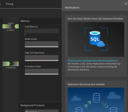
Spotlight Cloud
Spotlight Cloud is a database performance monitoring (DPM) solution made to extend a successful enterprise-scale installed solution to the cloud.
Case Study:
Introducing a new feature (Notifications) to our cloud DPM product, Spotlight Cloud.
Introducing a new feature (Notifications) to our cloud DPM product, Spotlight Cloud.
We had several unknowns to address:
- Where in the UI to most effectively organize and display notifications
- Where to add the entry point(s) to that display area
- Where/when across the UI to reinforce notification alerts
- Where to add entry point(s) to management and configuration of notifications
- How to distinguish between existing marketing notifications and the new connection-centric notifications
I started with early low fidelity concept designs with several feedback iterations, then built a research protocol and recruited for the research study. I conducted the moderated testing sessions, analyzed session videos and notes, organized the findings and provided my research-backed recommendations.
Research Summary
What we did:
- Conducted brief interviews with both current customers and persona-matching non-customers.
- Explored feelings about color usage and icons in UI, especially for urgency indication and distinguishing different UI messages, including non-urgent notifications.
- Presented mockup variations to gauge preferred styling, layout, and location for DS Disconnect messaging and general urgent/non-urgent notifications.
- Gathered open feedback on external communication methods, Spotlight Cloud as a whole, and notifications.
Why we did it:
We aimed to align Urgent Notification and DS Disconnect features with persona preferences for viewing user system and required Quest connections. Additionally, we evaluated the suitability of magenta for distinguishing DS-connection notifications from customer connection-related alarms and heat map tiles.
We aimed to align Urgent Notification and DS Disconnect features with persona preferences for viewing user system and required Quest connections. Additionally, we evaluated the suitability of magenta for distinguishing DS-connection notifications from customer connection-related alarms and heat map tiles.
What we found:
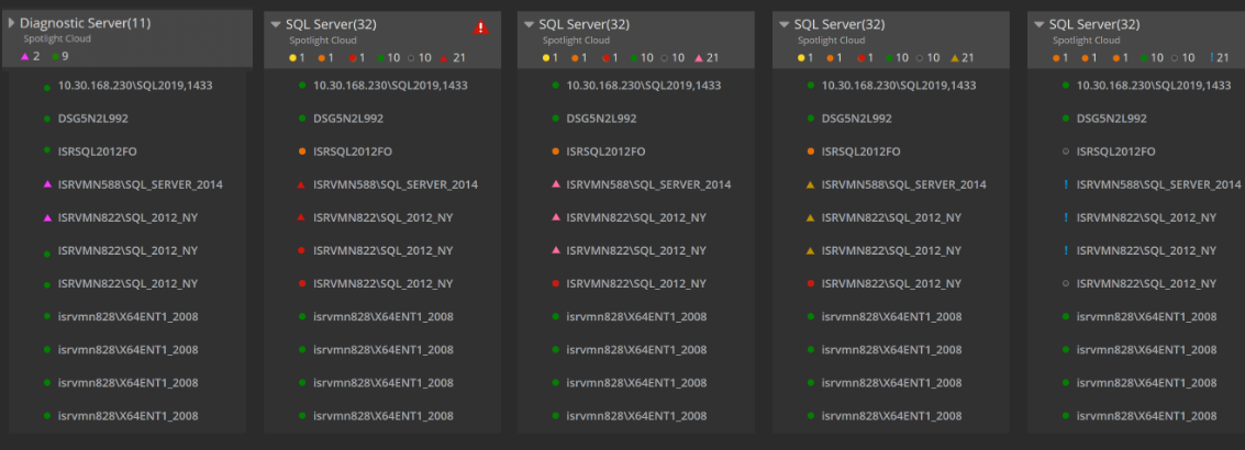
Users desire clear differentiation between their connections and external ones, and varied connection issue severity. Color is their favored distinguishing method. They prefer prominent urgent notification iconography, switching to informational (blue) when urgent notifications are absent.
Users desire clear differentiation between their connections and external ones, and varied connection issue severity. Color is their favored distinguishing method. They prefer prominent urgent notification iconography, switching to informational (blue) when urgent notifications are absent.
What we recommended based on the research:
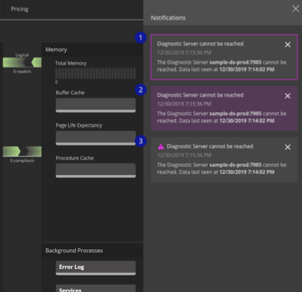
1. Introducing / keeping a new color (vivid magenta) to distinguish DS connections (ie. quest software connections) vs user connections, and to differentiate urgent notifications from non-urgent information notifications.
1. Introducing / keeping a new color (vivid magenta) to distinguish DS connections (ie. quest software connections) vs user connections, and to differentiate urgent notifications from non-urgent information notifications.
2. Adding an additional format for timestamps on DS disconnect notices: time elapsed since data visibility loss.
3. Prioritizing SMS text messages as the urgent notification channel for the first release, as it had the most support by far among the provided method options.
3. Prioritizing SMS text messages as the urgent notification channel for the first release, as it had the most support by far among the provided method options.
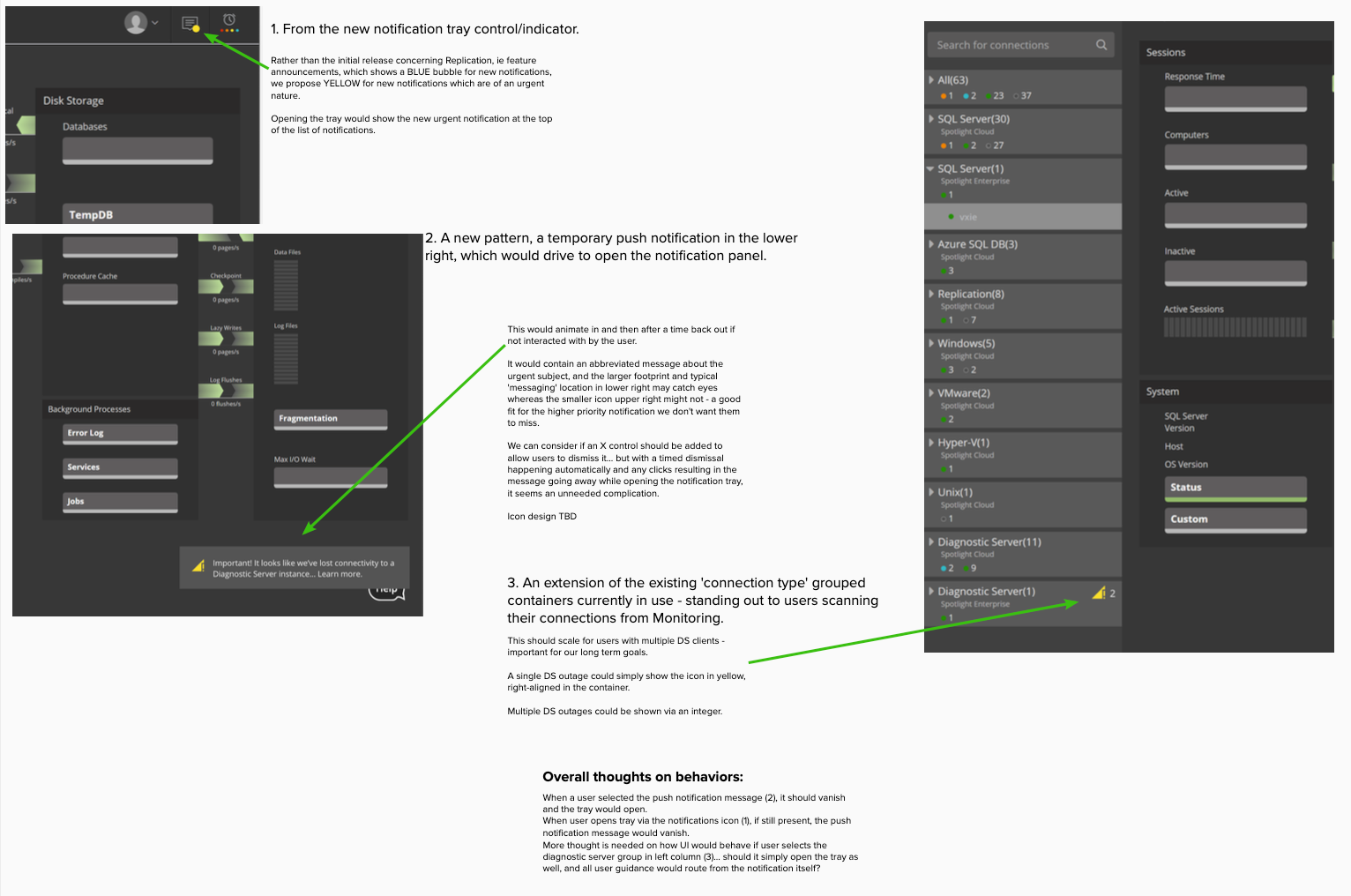
WHERE notifications should manifest
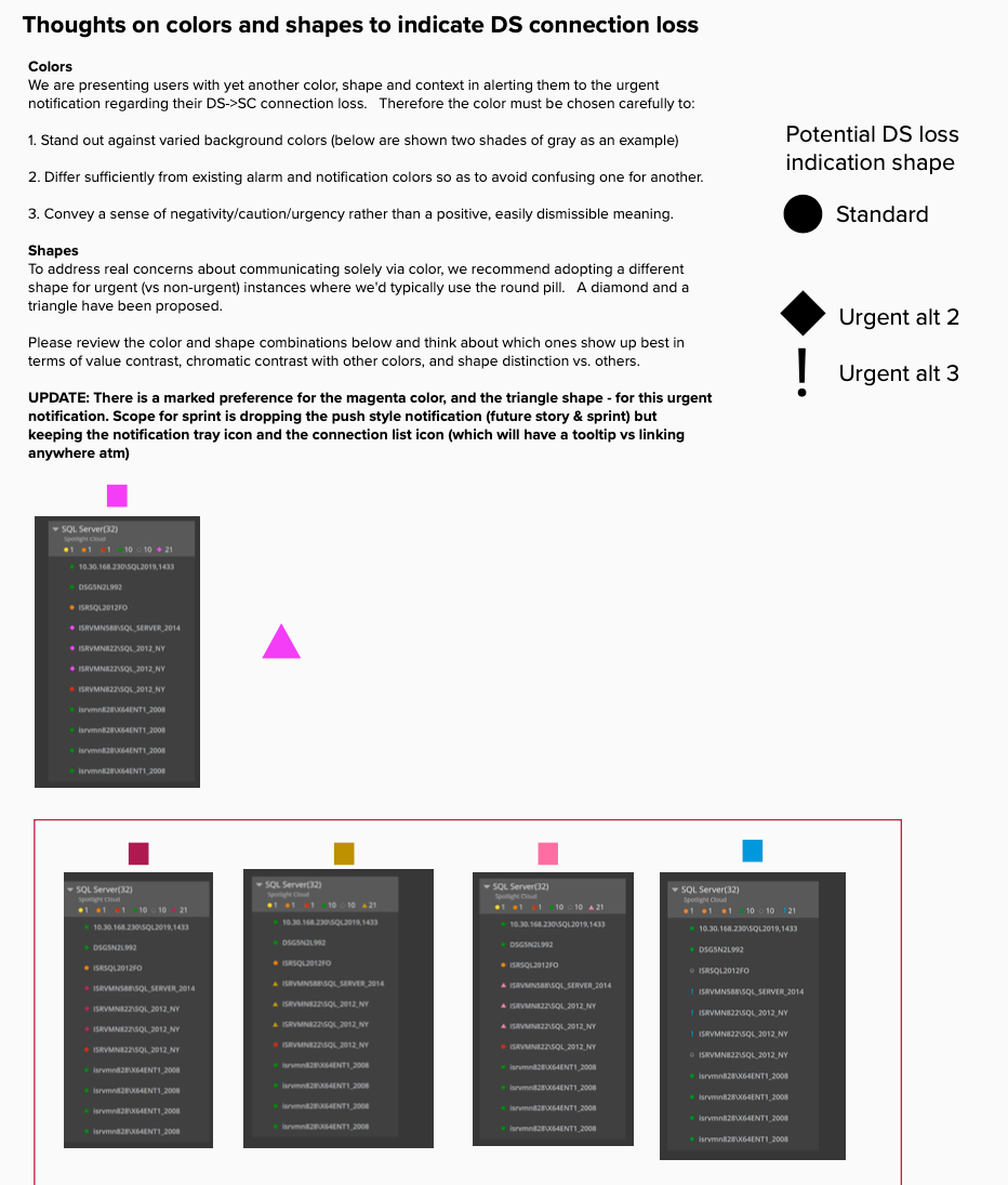
colors and shapes
marketing notifications
connection notifications
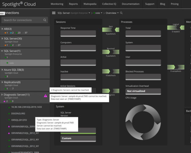
Connection Management panel options
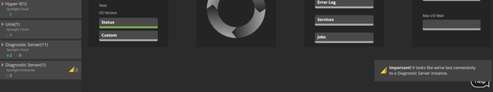
connection list and snackbar style, placement, color
Badge element on Notifications header entry point
Case Study:
Evaluate our workflow for configuring email notifications.
Evaluate our workflow for configuring email notifications.
We wanted to test a proposed workflow and discover:
Will the users find the feature in the UI?
Does the number of interactions required fit their need for efficiency?
Are we providing the right feedback throughout the flow?
How are they and their organization using notifications today?
Will the users find the feature in the UI?
Does the number of interactions required fit their need for efficiency?
Are we providing the right feedback throughout the flow?
How are they and their organization using notifications today?
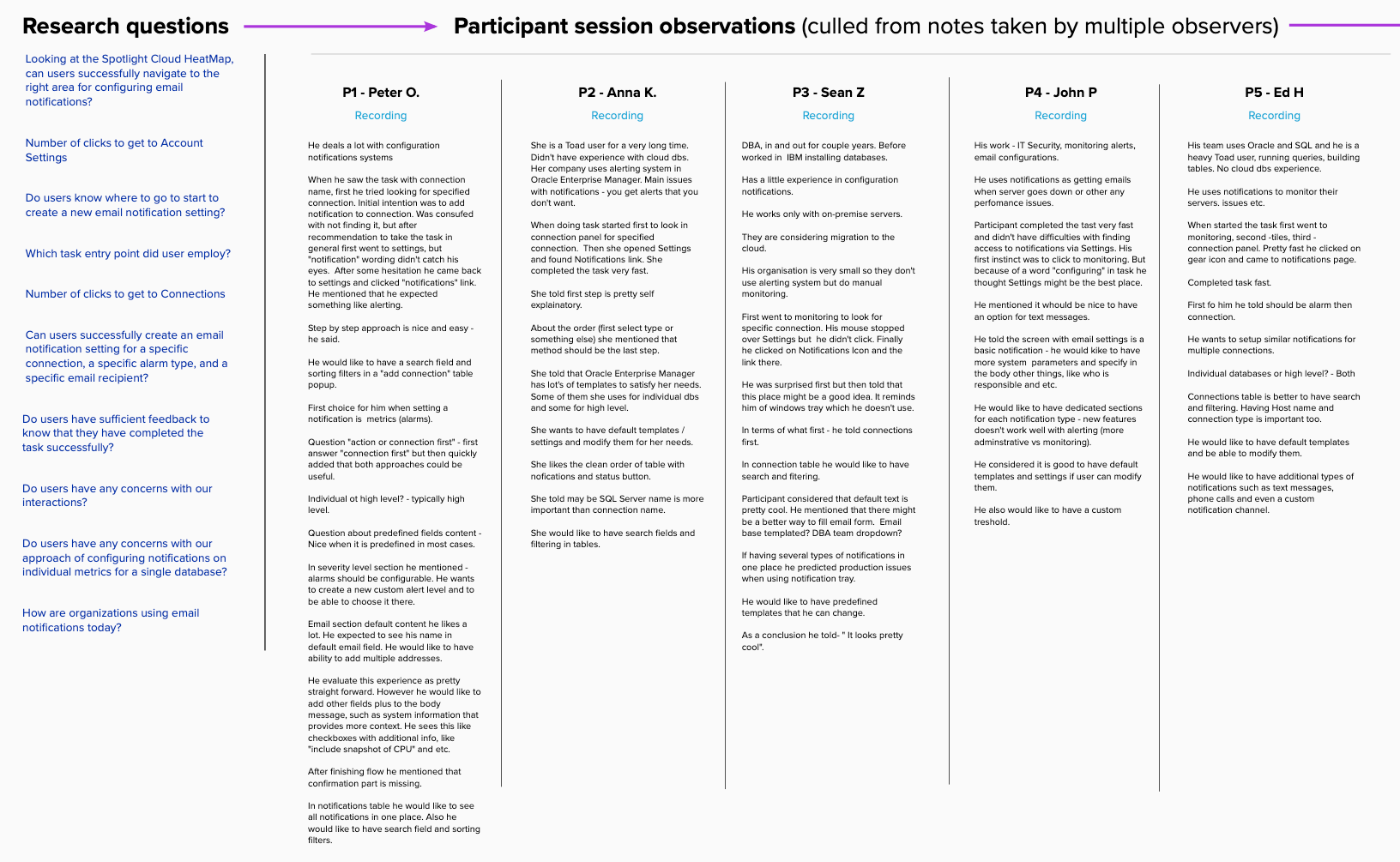
This project involved a matured concept design, initial prototype and revised protoypes for testing, a moderator guide, recruiting for the study, conducting the moderated testing sessions, analyzing session videos and notes, affinity diagrams, ROI plotting and providing the research-backed recommendations.
Research Summary:
What we did:
Our clarified research goals led to participant and question selection.
Our clarified research goals led to participant and question selection.
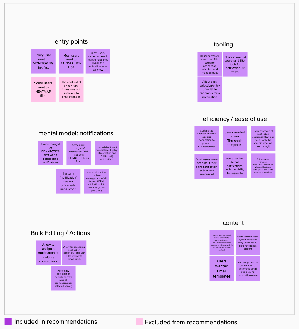
Usability testing notes were culled into observations per participant, then clustered into groups in affinity diagrams to surface themes.
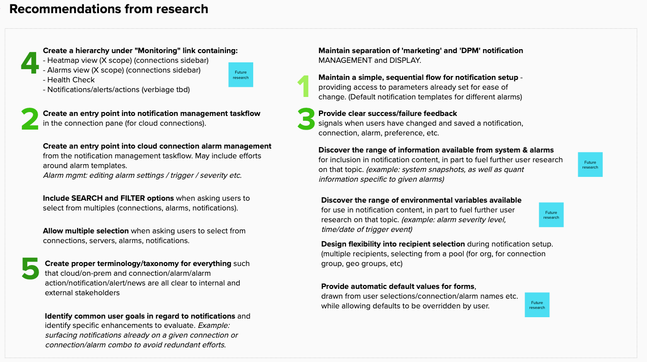
Themes were distilled into specific recommendations, which were then prioritized through role-based perspectives (design & product, architecture initially, to be followed by development, support, test, and sales.)
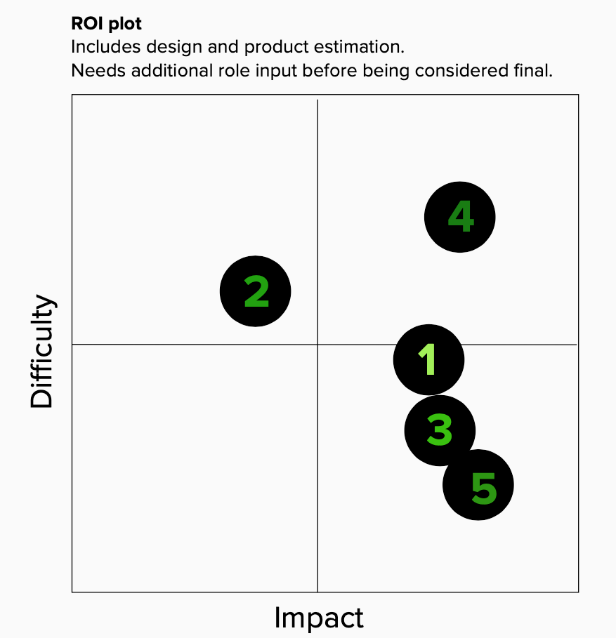
Top 5 recommendations were mapped on a grid with axes of Difficulty and Impact to help visualize the best balance between the two when determining sprint sequencing.
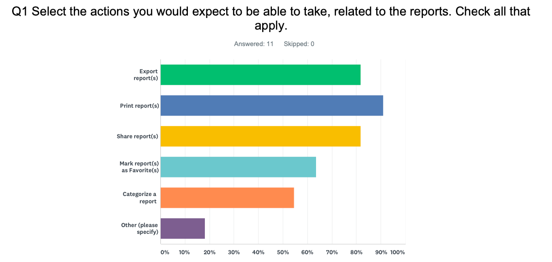
Reports - Aligning Feature fit with User needs
For the success of our embedded reports feature, we aimed to align it with user expectations for DPM reports. Through informal questions during testing and a dedicated survey, we confirmed basic expectations and prioritized functionality based on user needs and development complexity. This ensured efficient development, testing, release, and maintenance.